
This is the first image. This image shows two different types of fish. 1) Blue fish and 2) A red fish. That is what the difference in the colour is, but when I first saw the image I realised the first difference it is a contrasting image is because of the quantity. The blue type of fish are shown in a group of 12, whereas the red type of fish is alone. In a way I feel a sort of sympathy for the red fish, as it is shown it alone, and with no other of its type around it.
I can't really explain this image in much detail, as I am sure you would agree it is a very simple image, and this is why I chose this image first, as it is less complex then other contrasting images.
This image is quite simplistic, but it proves a point as this could easily represent social life at school for example. I think this because there are usually groups in school, and people that are classed as different are sometimes left outside of these groups.
On the other hand, the red fish could seem intimidating to the blue fish, because it is different.

I think this is a clever and interesting picture because the illustrator hasn't just chosen to draw a normal picture, he has chosen to be different and add some contrast to the picture. By just showing the outline of the less detailed part of the picture, in a way it sort of shows the steps to drawing a picture because when you start a picture you draw the outline of it in pencil, and then gradually add the detail and colour to the picture. So instead of adding colour and detail to all of the picture, he has chosen to leave some blank, which makes the picture less of a normal type of picture and more of a different and interesting picture.

I see the front landscape as a more simple and calming photo as there's not much going on, compared to the more complex looking photo of the countryside. I think the difference in tones works really well too, nothing stands out too much as they both give the same sort of message. Overall a great contrasting image.
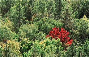
I really like this photograph, as its different and I think the use of colour in it is very clever. It makes me feel good, as it portrays a message that being different to what is seen as normal is a great thing.
I hope you liked this post, and I hope it made sense.
Thanks :)
hey i really like this and btw i was gonna do those pics as well i hought exactly the same thing wen i saw the fish! ;)
ReplyDeleteAww well done chrissy! Really great x
ReplyDeleteThanks Anoja... cool :)
ReplyDeleteThank you Hafiza .. I didn't understand it before but I think I understood in the end :)
Christina, a great start. You have shown some clear method in your analysis especially the first image of the fishes. The others reveal a clear personal response and you have tried to explore alternative versions of the final image, which I found interesting too. Well done.
ReplyDeleteAnd well done to Anoja and Hafiza - you have clearly understood that blogs are about communication.
Thanks :)
ReplyDeleteThanks sir
ReplyDeleteAnoja said thanks too
We cant help commenting when its amaazing!
heya, well done crissy its AUSOME!!!!!! :)
ReplyDelete:)
ReplyDelete